When Ms. Nasiri brought us her accessory-brand idea, the task wasn’t merely to coin a name; it was to uncover the brand’s reason for being. With a human-centered approach, we began with several in-depth conversations to access her lived insights, then expanded into market research across Iran—especially Tehran. The findings revealed a meaningful gap: Gen Z audiences seek accessories that simultaneously deliver identity expression, accessibility, and responsibility, while the market skewed either overly luxe and out of reach or repetitive and soulless. We chose to build a brand that doesn’t just imitate Gen Z’s preferences, but interprets them.
Brand Strategy: From Positioning to a Narrative Platform
After analyzing direct/indirect competitors, mapping the perceptual landscape, and conducting structured interviews, our strategy team defined the positioning as follows: accessories for exploring and expressing the self, in step with the rhythm of urban life. The value proposition balances a triad of minimal design, personalization, and fair pricing, underpinned by a strong commitment to social and environmental responsibility at the brand level.
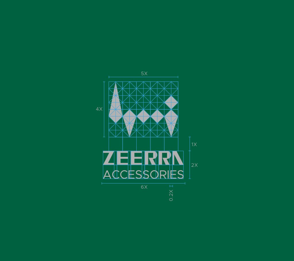
Values, mission, and vision were articulated in un-hyped language so that “commitment” translates into experience, not mere claims. Naming was led by Bold Studio’s copywriter, and the logic of (ZEE + RRA) was turned into a narrative platform: every brand action must have a reason—Because details matter; because your mood matters. The brand voice was set as energetic, experiential, and friendly, so the brand acts as a companion who suggests, not a megaphone that sells.
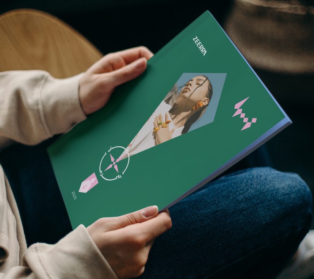
Visual Identity: Where Sign Meets City
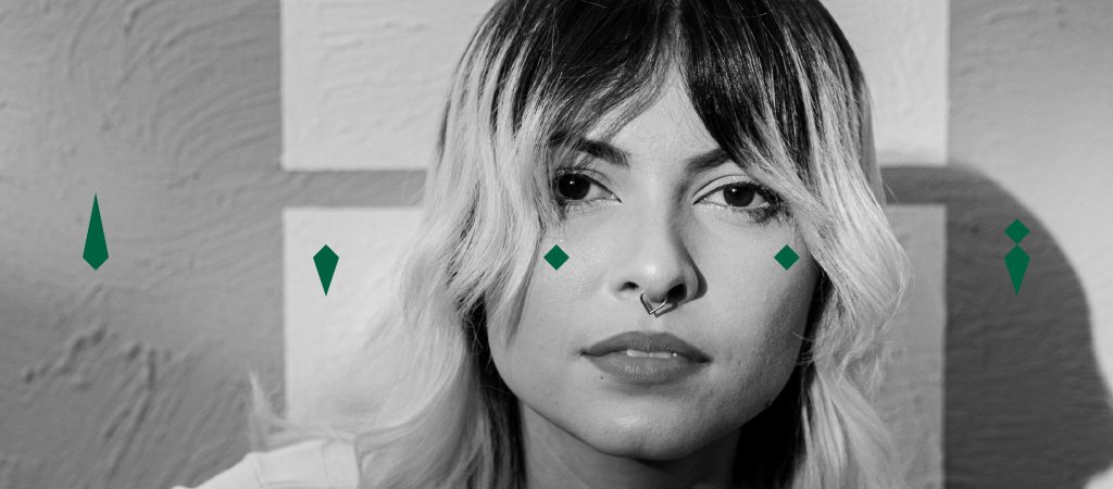
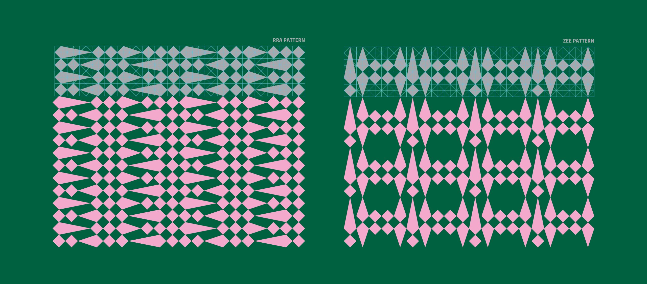
The visual language draws on graffiti lettering—the free, urban expression of Gen Z—and multi-faceted diamond forms—a metaphor for cut, brilliance, and personalization. This managed contrast creates a modern, bold personality: fluid motion set against sharp edges.
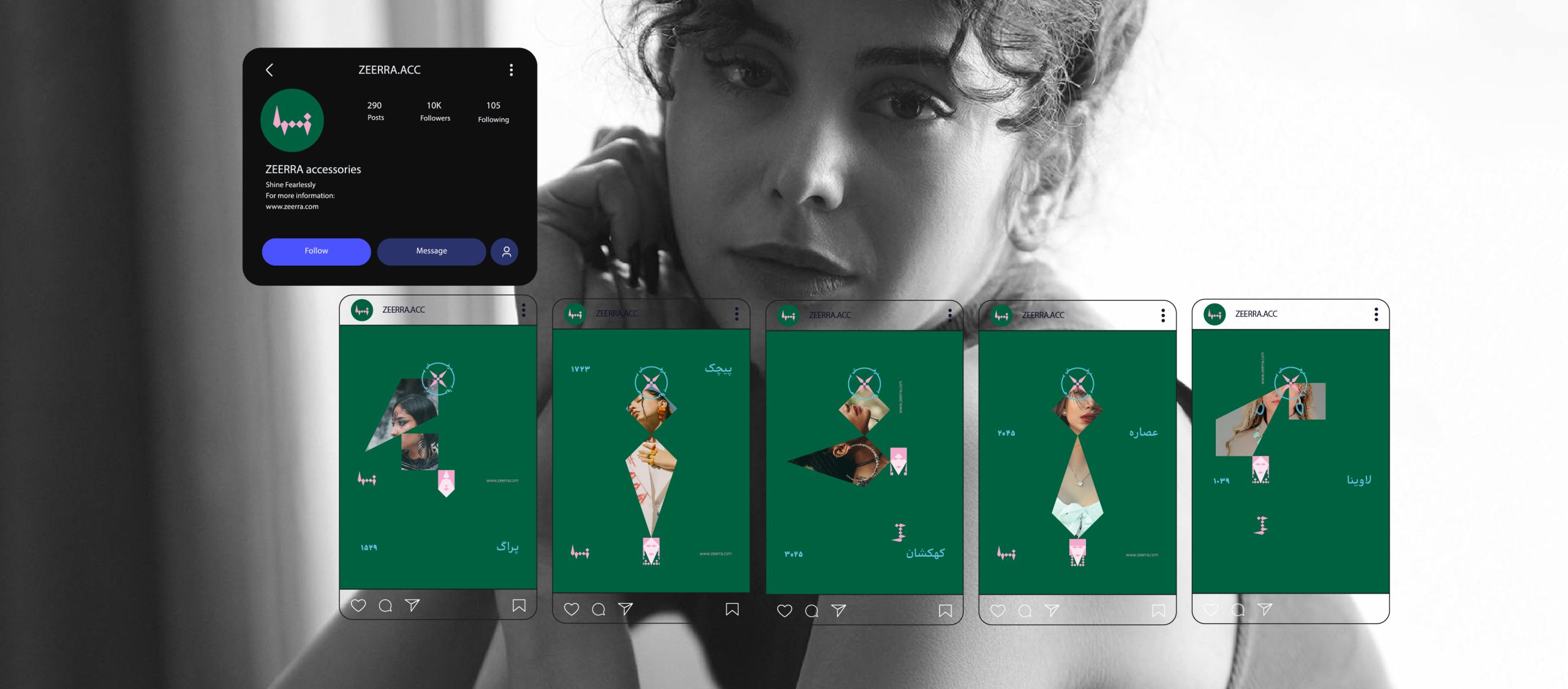
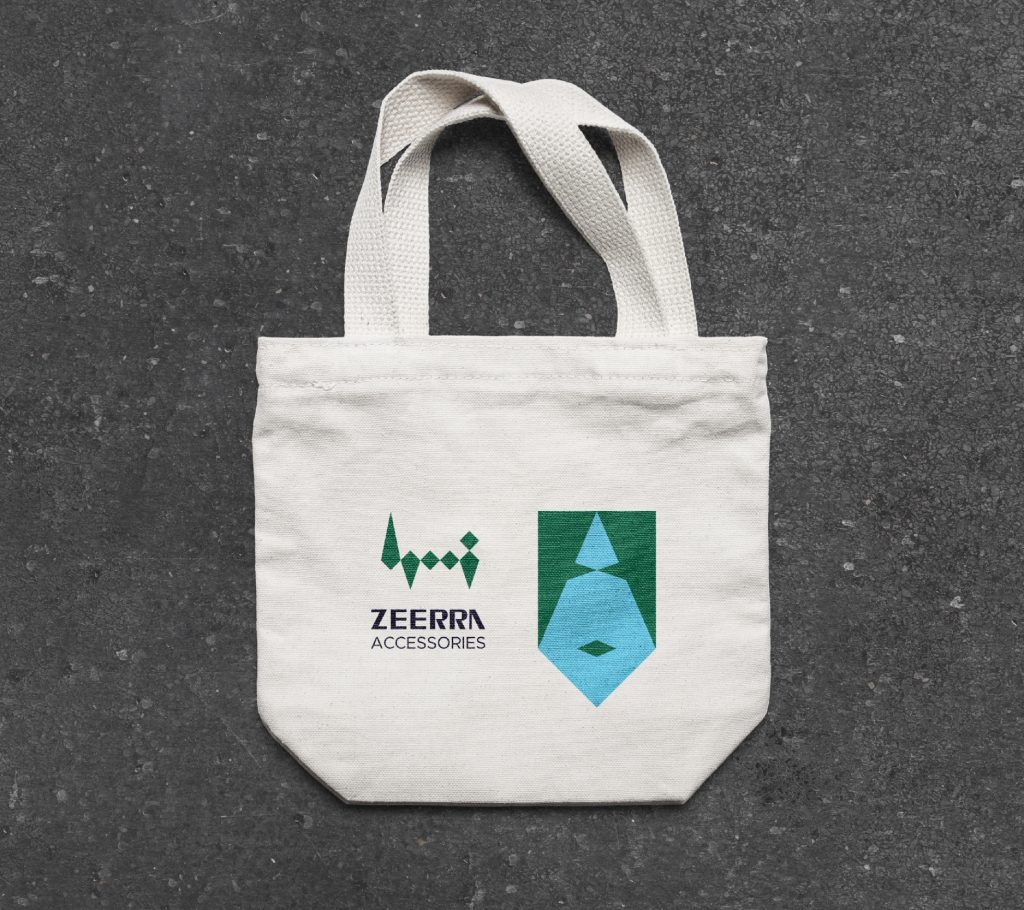
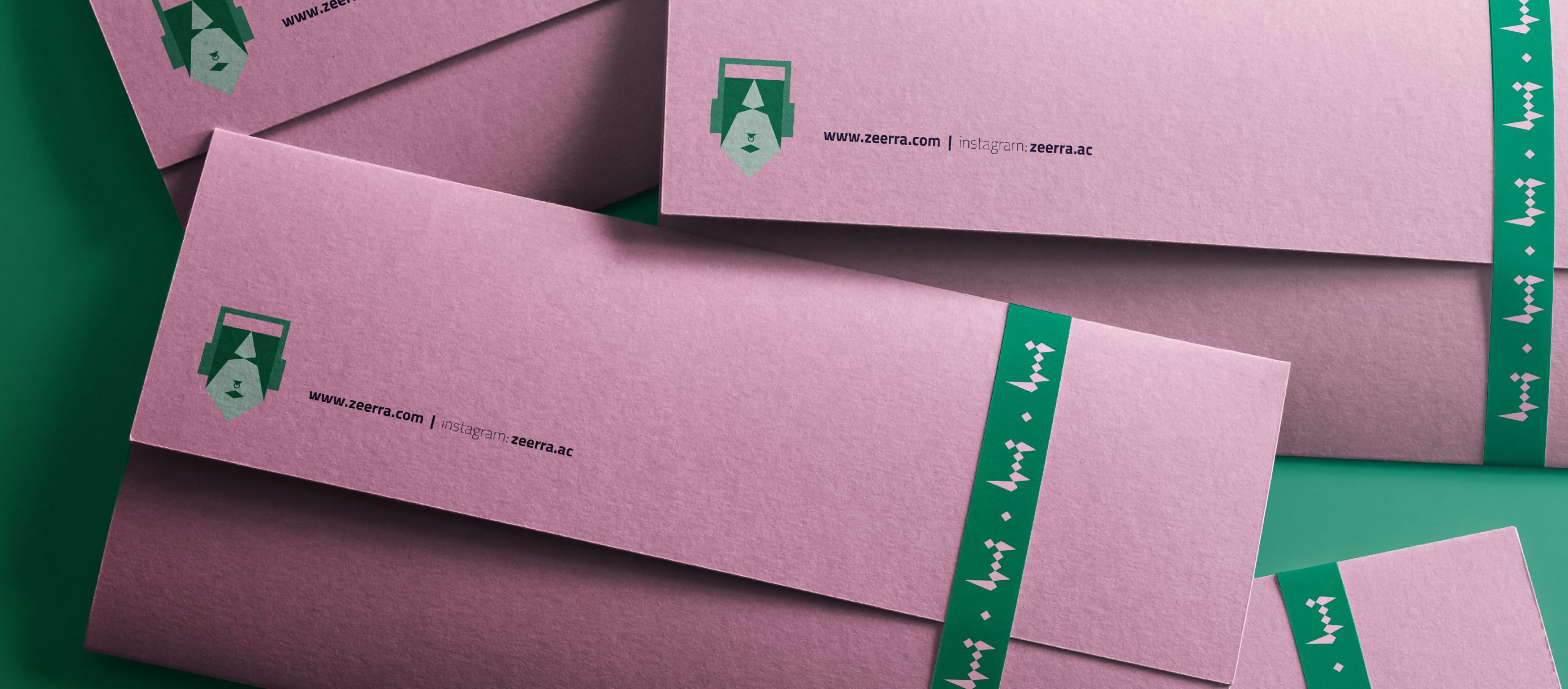
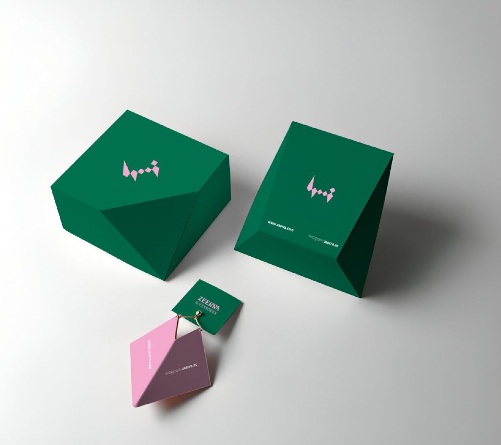
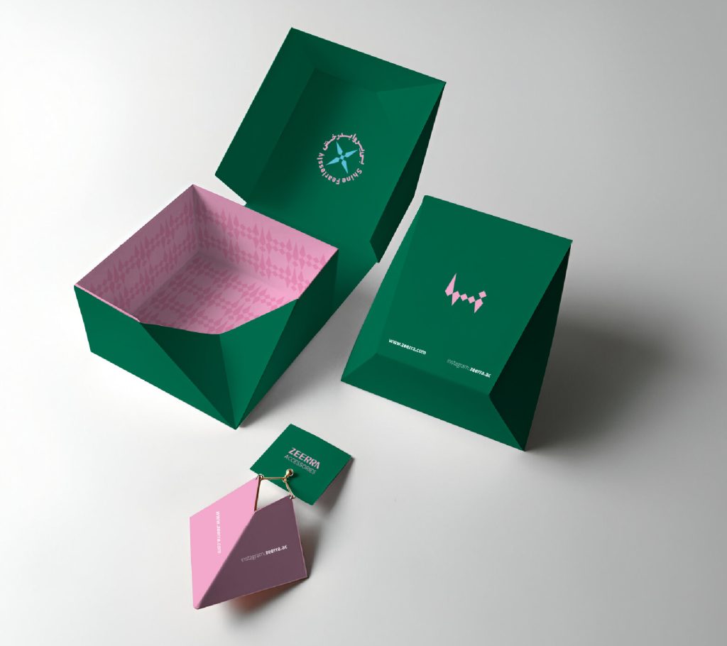
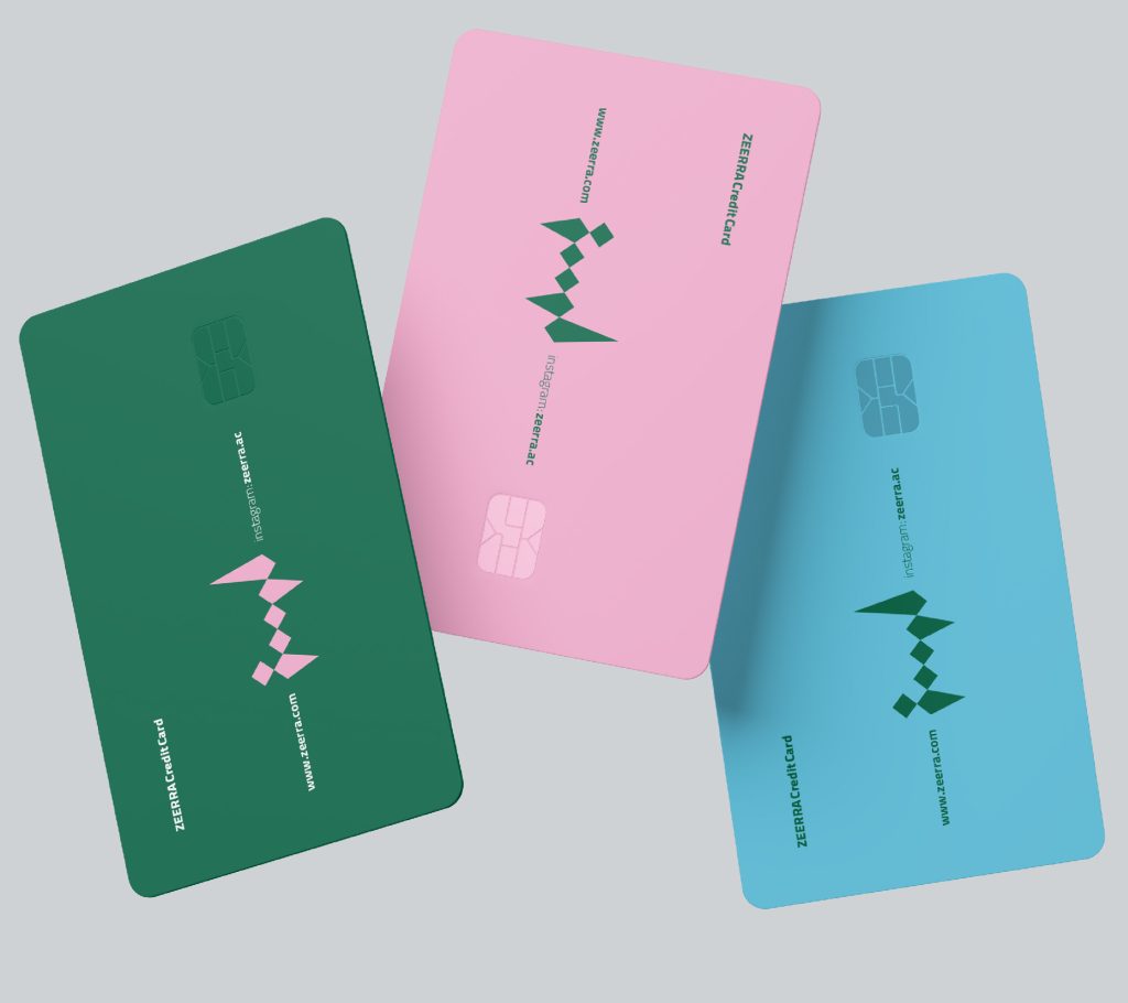
The four-color palette follows functional logic: Green (primary—sustainability and freshness), Pink (secondary—joy and affinity), Navy and Light Blue (complements for depth and digital freshness).
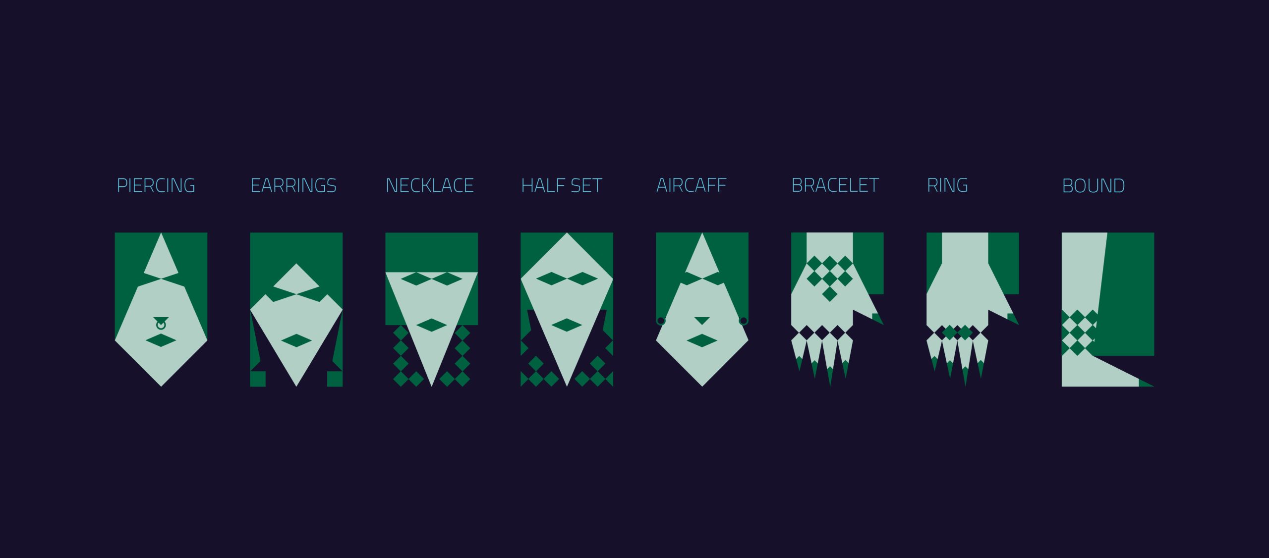
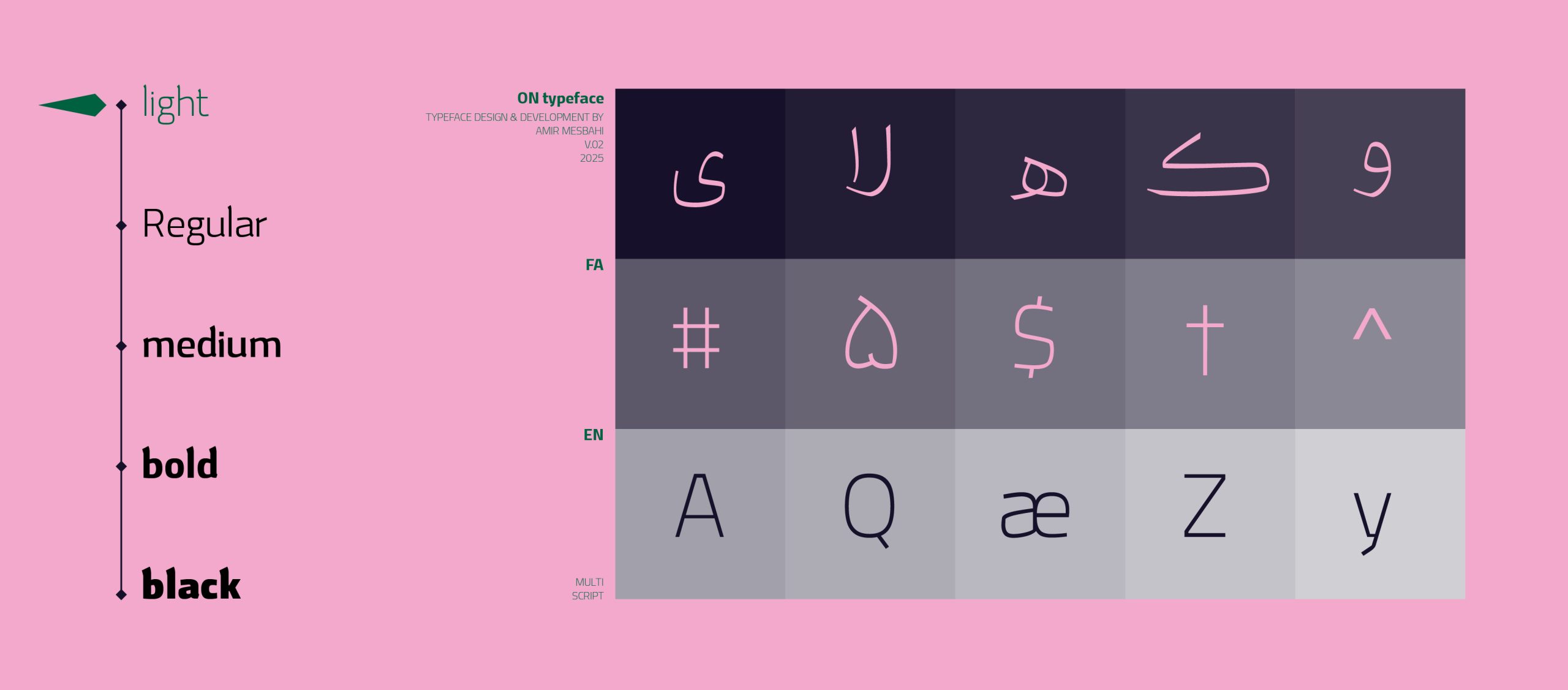
At the level of marks, the Latin logotype ZEERRA was crafted with a semi-calligraphic rhythm and sharp corners; alongside it, a Persian sign with deliberately reduced legibility functions as an “urban gesture” that communicates feeling over reading. For each product category, faceted motifs were defined as key visuals, serving as an instant signature across touchpoints. Typography operates on two tiers: characterful display for storytelling and clean, readable text for decision-making.
Touchpoints: From Experience to Evidence
-
Instagram: A serialized calendar using the “Because…” format to connect reason with reference; short Reels centered on personalization, limited collection launches, and collaborations with micro-influencers.
-
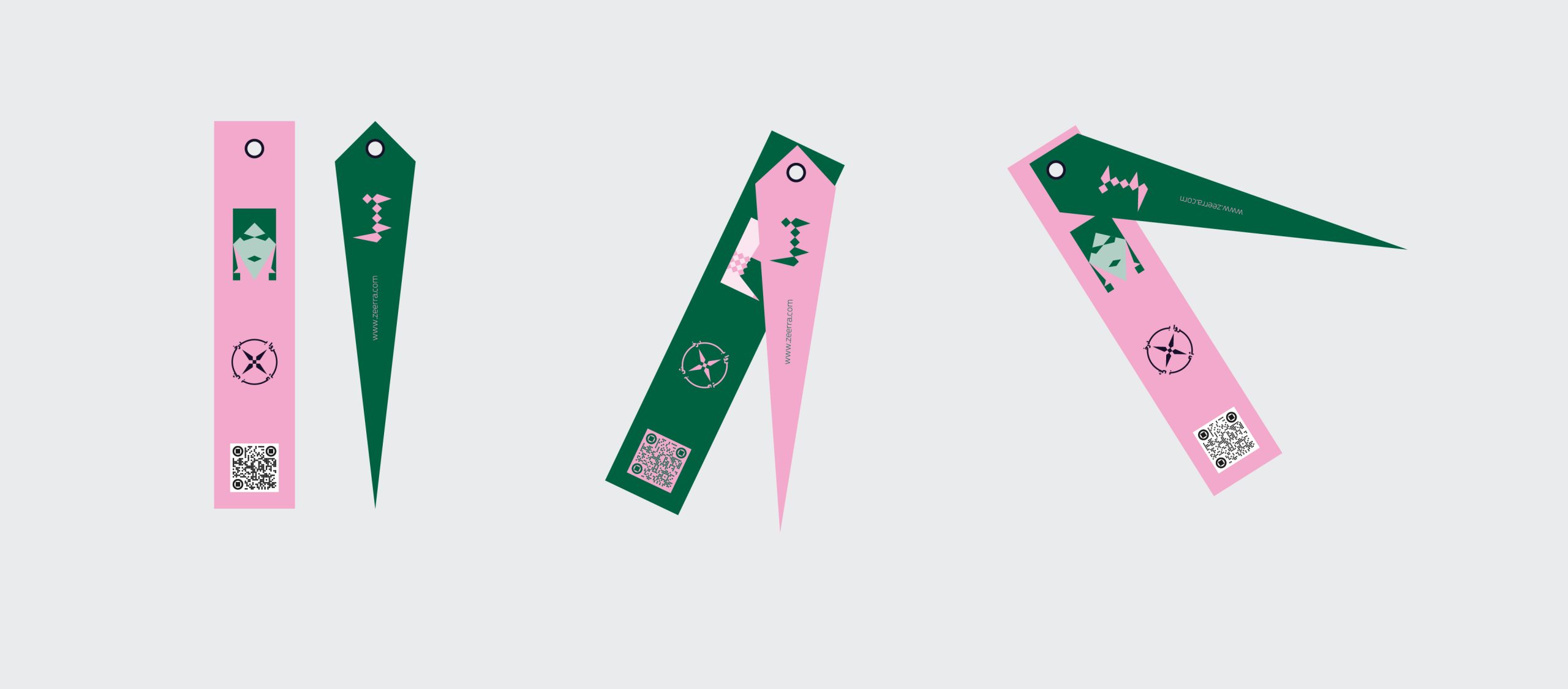
Packaging: A modular structure made from recycled/recyclable materials, smart single-ink printing on colored stocks from the brand palette (to reduce ink usage), a product story card, and a QR leading to care instructions and behind-the-scenes content.
-
Brand Guide: Logo rules and ratios, color/contrast system, faceted iconography, post/story composition templates, caption-tone governance, and DO/DON’T examples to keep launches agile.
Results & Learnings
The new identity made ZEERRA instantly recognizable in crowded feeds: the graffiti/facet synthesis and the four-color palette formed a distinct visual signature. The “Because…” formats improved save and share rates, while limited series created a healthy sense of urgency.