Mana Foreign Language Academy is a hybrid online and in-person educational center located in District 1 of Tehran, focused on teaching international languages to children and teenagers. Its educational approach is built on gamification and interactive learning experiences. Mana approached us at the very beginning of its brand journey, without a defined identity and in a highly saturated market of language institutes, especially in the competitive landscape of District 1. Our mission was to build a brand that would be memorable and attractive for girls and teenagers, while also being a distinctive and trustworthy choice from the parents’ perspective.
To design the brand strategy, we first conducted a structured analysis of the audience and the competitive landscape: in-depth interviews with students and parents, analysis of the current generation of children and teenagers, and a comparison of language institutes in terms of messaging, visual identity, and communication style. Along the way, we defined two main personas as core audiences: children aged 6–12, who prefer to learn through play, storytelling, and imagery; and teenagers aged 13–17, who view language as a tool for identity, independence, and social interaction. Alongside them, parents—especially mothers—were identified as the key decision-makers, looking for a safe, girls-only environment with serious educational quality. The main challenges included maintaining focus amid the overload of classes and extracurricular activities, the need for a safe and dedicated space for girls, and the lack of environments that connect language learning with the social and cultural concerns of teenagers.
These findings were distilled into a central insight: Mana is not just a language school; it is a space that combines language education with lifestyle, culture, and art, creating an inspiring environment for girls and young women to learn international languages in a deep and lasting way and grow into multilingual, confident, and empowered individuals. In this narrative, language becomes a gateway to awareness, independence, and social participation. Based on this, Mana’s positioning was defined as a blend of “language and lifestyle”; Mana presents itself as a language and multicultural lifestyle academy for girls and teenagers. The brand personality is a combination of the Explorer archetype (as the main axis) and the Creator; a brand that invites its audience to discover the world and craft their own personal story. The core brand values include respect for culture and art, dynamism, responsibility, creativity, and personal growth, while the brand promise centers on enabling a multilingual lifestyle and paying special attention to the cultural and social needs of girls. Mana’s tone of voice is defined as friendly, energetic, and innovative—professional and trustworthy for parents, yet inspiring and relatable for girls and teenagers.
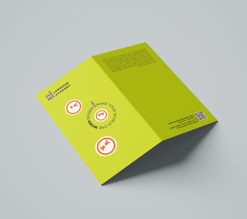
In the next phase, this strategy was translated into design language and visual identity. Given the international nature of the academy, the Mana logo was designed as an English logotype based on the word “mana,” so that the brand name is clearly visible and easily remembered in every touchpoint—a deliberate choice as part of the awareness strategy for a new player in the market. The letters “m” and “n” were designed in such a way that, together, they resemble a human pictogram—a person in motion and growth. In this way, the logo simultaneously showcases the brand name and subtly alludes to Mana’s focus on personal growth and character development.
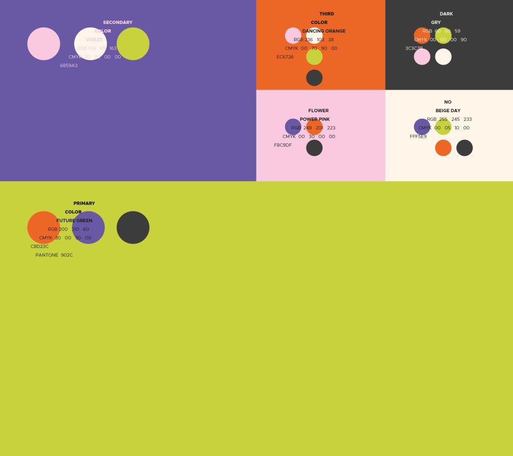
The brand’s color system was defined with a long-term perspective and the ability to scale in the future: green as the primary color and purple as the secondary, complemented by a palette of supporting colors such as orange, pink, gray, and cream. Green reflects growth, freshness, and personal development, while purple reinforces creativity, distinctiveness, and a connection to the world of culture and art. This color combination allows Mana to expand its visual identity across campaigns, environmental graphics, digital platforms, and future products without sacrificing consistency.
In terms of typography, the Metropolis typeface was selected as the primary English font and used as the basis for the logotype design. For Persian, the Peyda type family was chosen due to its high legibility in both print and digital media, as well as its harmony with the brand’s visual language. Together, these choices created a coherent bilingual typographic system that can be consistently applied across all brand touchpoints.
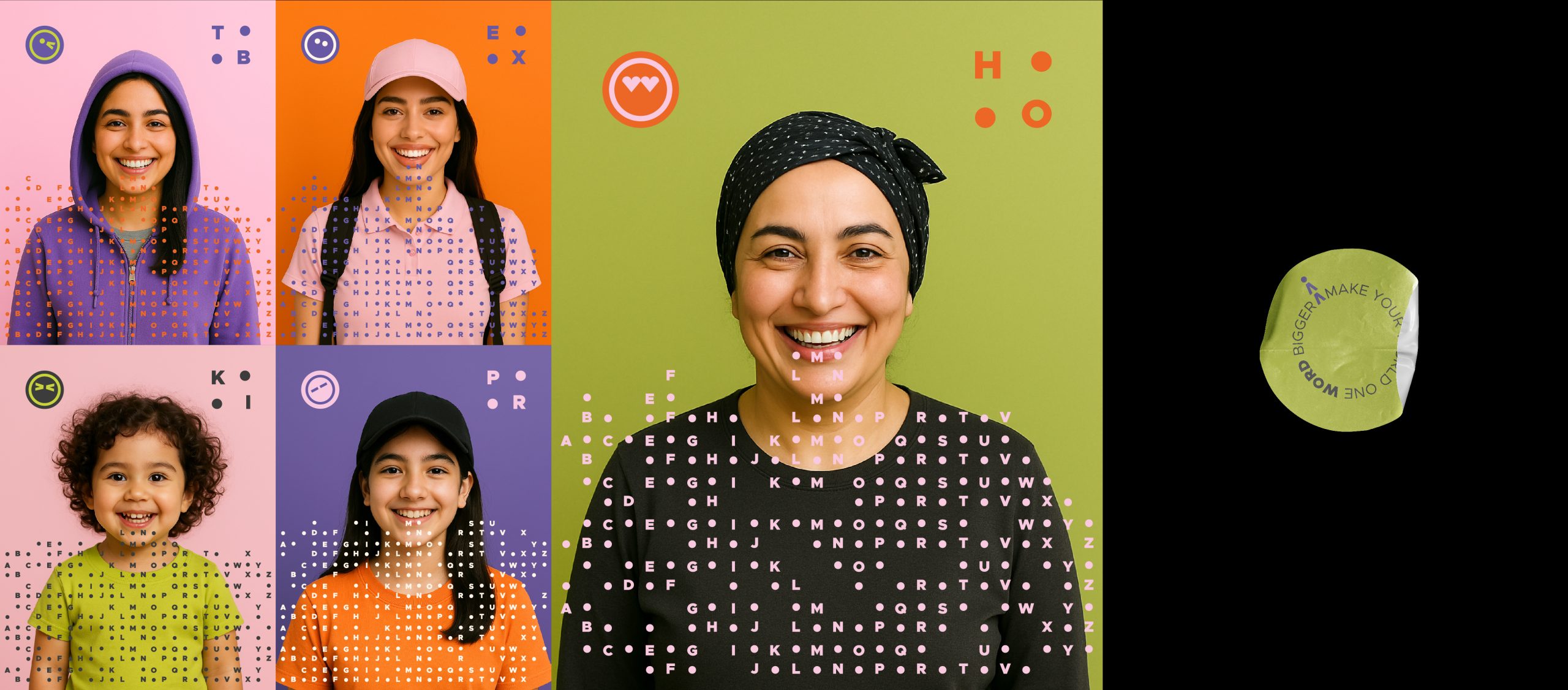
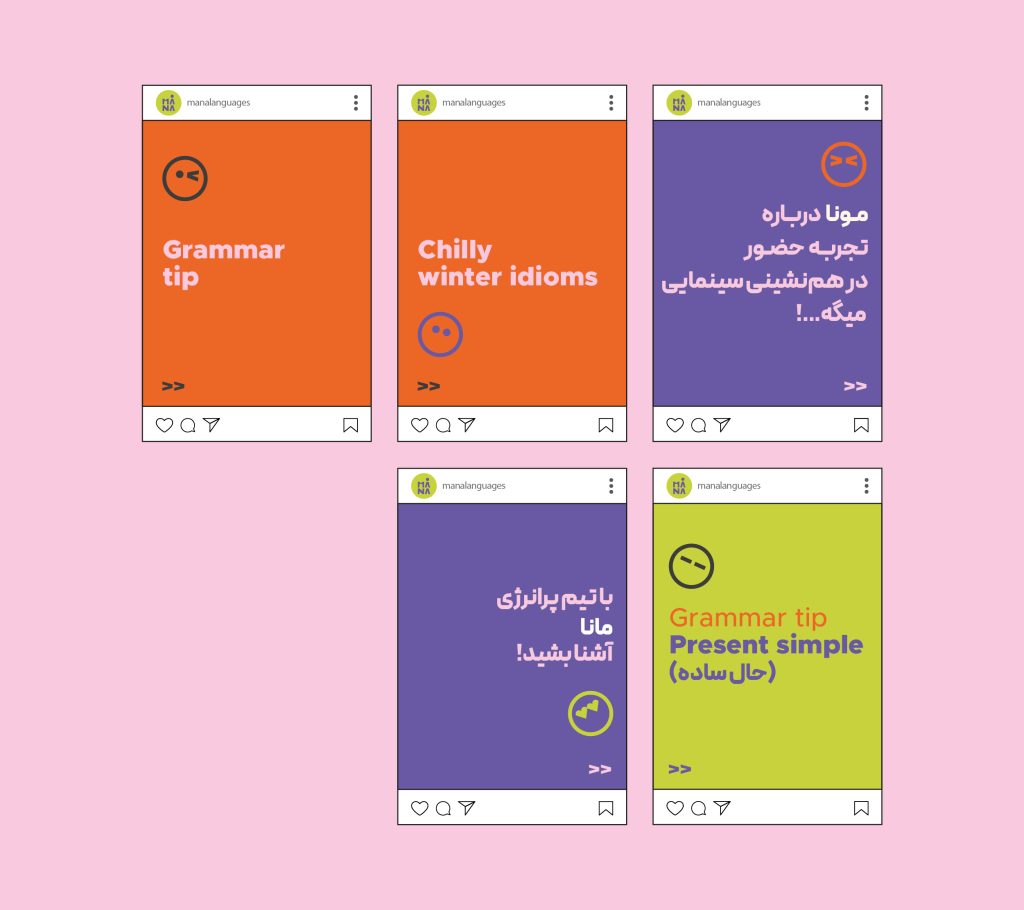
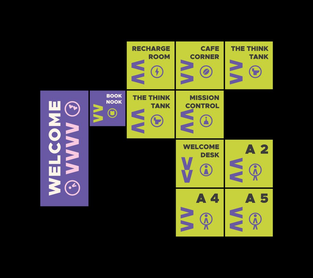
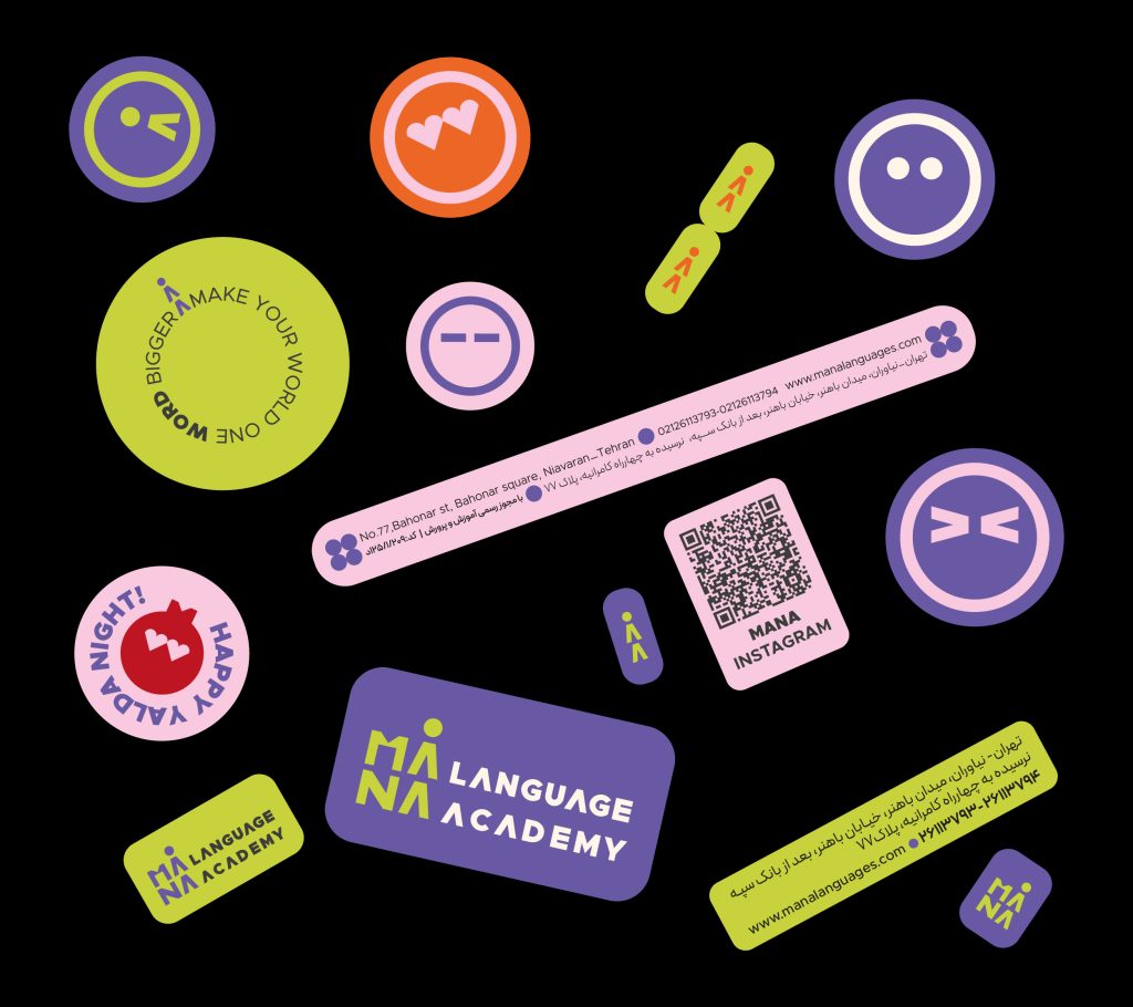
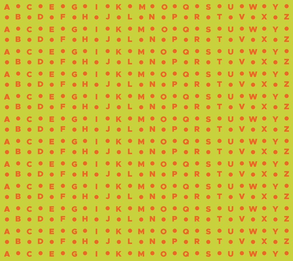
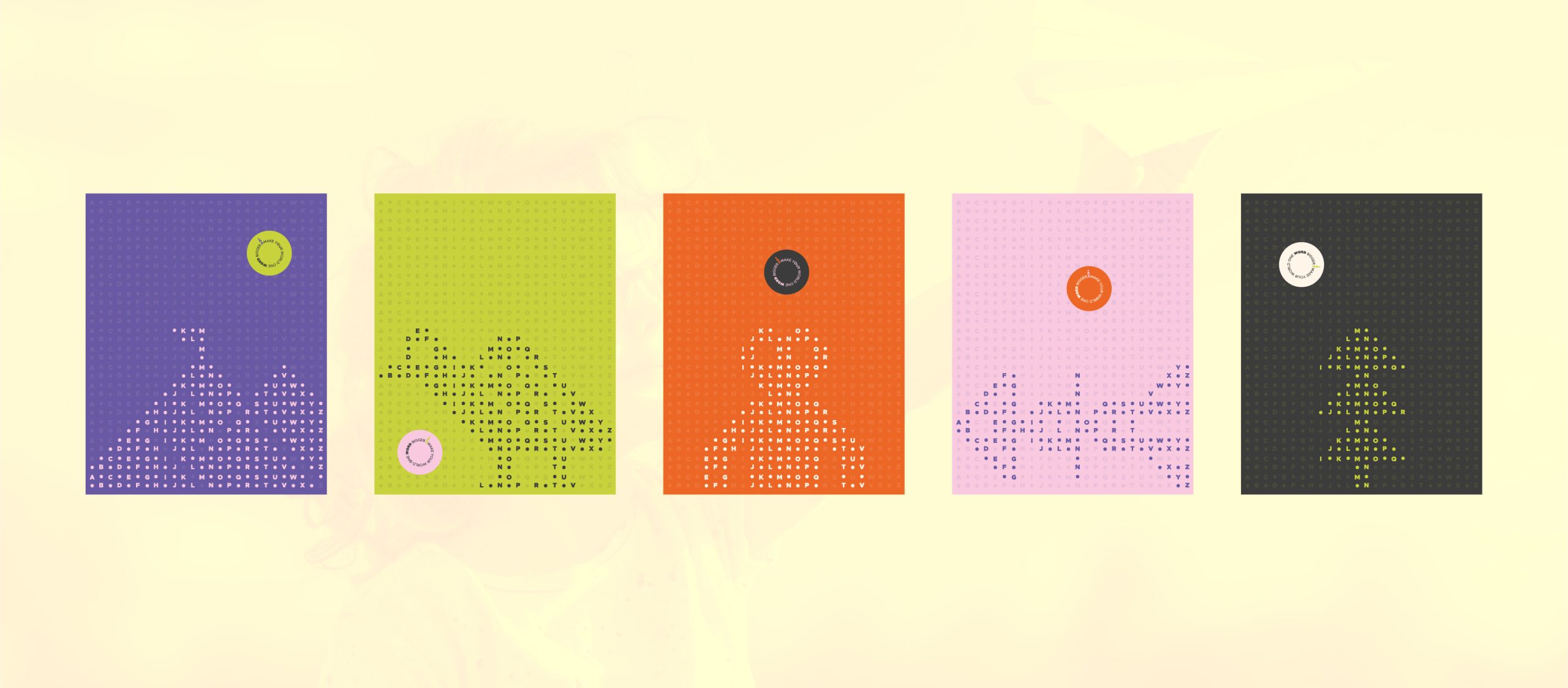
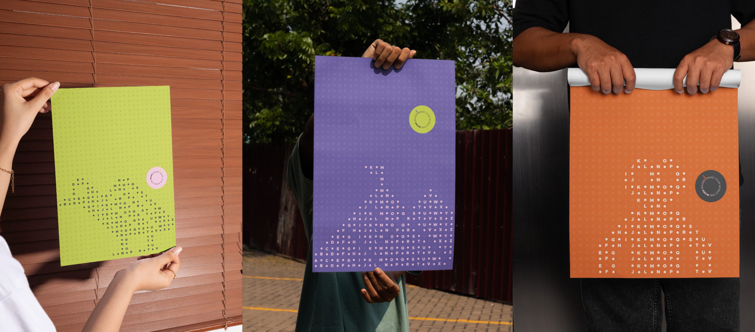
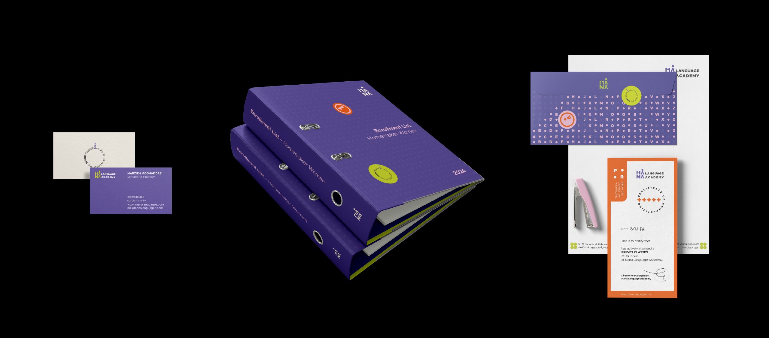
The brand pattern was developed from the English alphabet, arranged in an abstract grid. By intentionally removing parts of this grid, a sense of rhythm and dynamism was introduced to avoid a rigid, monotonous repetition. This pattern is used in stationery, environmental graphics, and digital spaces, adding a layer of movement and a sense of discovery to the visual identity. To connect more closely with the world of children, a set of stickers and expressive character icons was designed for use in notebooks, learning materials, and digital content, building a warm, playful relationship between the brand and its audience.

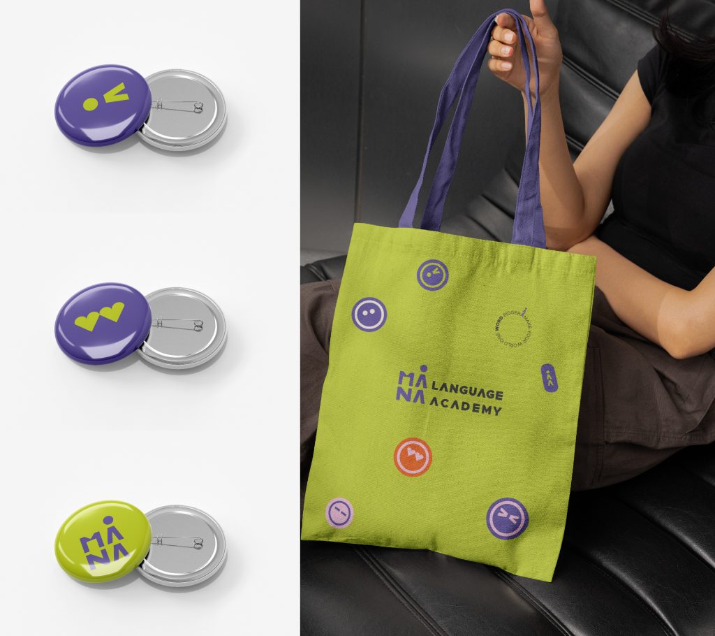
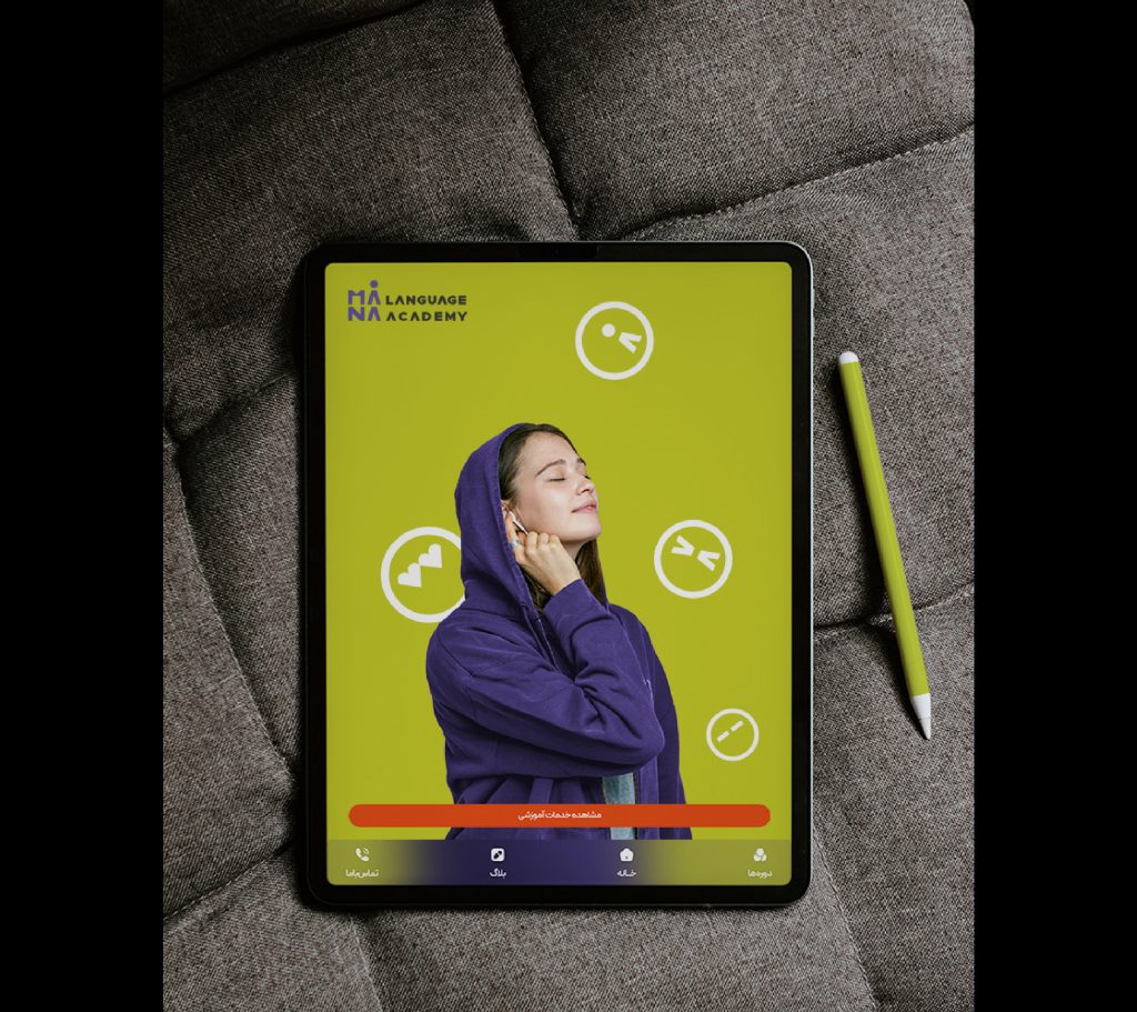
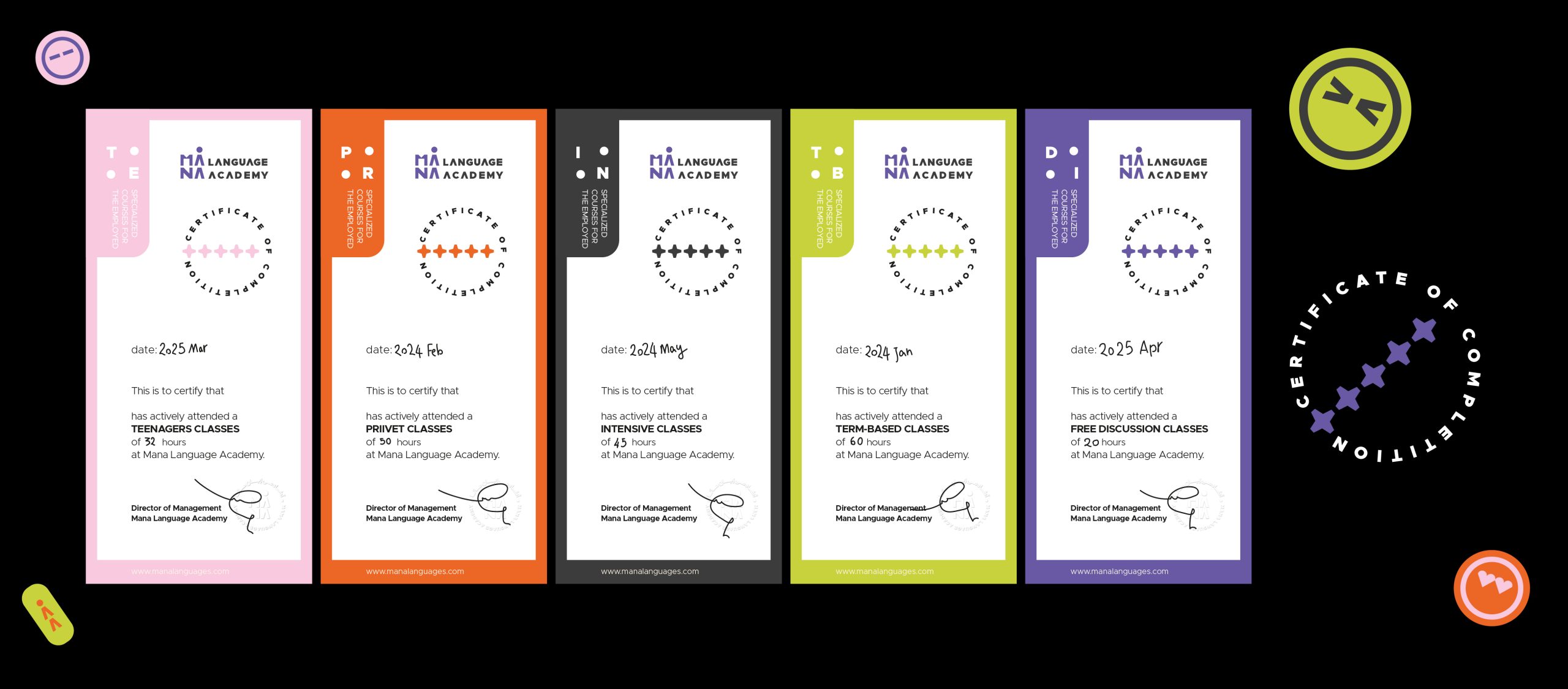
In photography, the focus was on creating authentic and lively imagery, using natural-looking lighting and thoughtful incorporation of brand colors in clothing, backgrounds, and details. This approach forms the foundation of visual content for the website, Instagram, and other Mana communication channels. The designed identity was then implemented across a series of key touchpoints: business cards, letterheads, folders, notebooks, and certificates; staff uniforms; exterior signage, wayfinding, and wall graphics within the academy; and the visual identity of the Instagram page and website. The result is a cohesive brand world for Mana that weaves language together with lifestyle, culture, and art, and defines a distinctive, meaningful, and future-oriented position for the academy in the highly competitive language education market.